
Grade Level
6 - 8
minutes
45 to 90 minutes
subject
Physical Science, Engineering and Tech
stem practices
Asking Questions and Defining Problems, Developing and Using Models
Activity Type:
After School Activity, Family activity, STEAM, climate change, Engineering design challenge
Do you see the red lines on the map below? What do you think they mean? What patterns do they seem to follow?
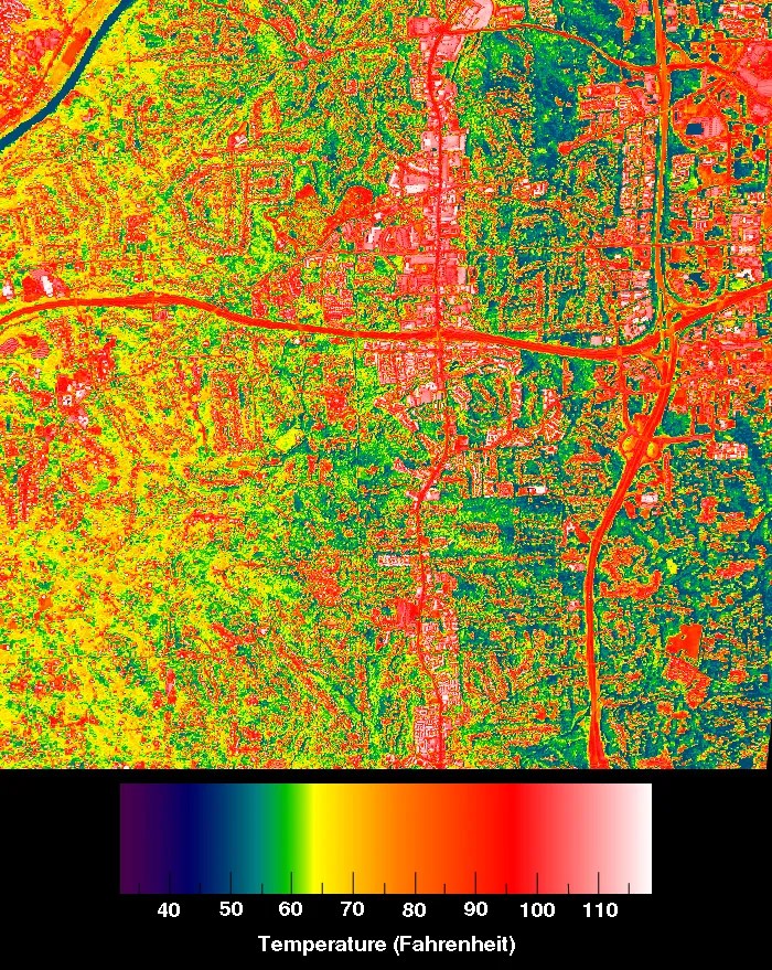
Did you know that NASA looks at global weather from space? They use more than 350,000 sensors on the International Space Station (ISS) to collect data and turn it into images like the one above, representing the heat radiating from the streets. You can use these images to make informed decisions for city planning to build healthier communities. Wow!
Take another look at the map and check out the legend at the bottom. What does it tell you? What do the different colors mean? What do you think it would feel like if you were taking a walk on one of the roads marked in red?
Compare the temperatures in the image with those in your city. Use a weather app to determine the temperature in your community today. Make sure you get the temperature in Fahrenheit, like the legend on the map above, and not in Celsius. Are the temperatures in your area hotter or cooler than the temperatures shown on the map above?
Down To Earth: Space Science For Community Change
Check Surface Temperatures In Your Neighborhood
The temperature reported for the weather is the average air temperature in a given environment—the ambient temperature. However, as you can see on the map above, the surface temperature can vary greatly by location. You can use some old-school sensor technology to measure the surface temperature around your neighborhood and compare it to the ambient temperature.
Here’s what you need to do:
- Record the ambient air temperature reported by a weather app for your area on the Sensor Watch chart.
- Take a thermometer outside and put it on the pavement in a parking lot or similar area. NOTE: Watch for cars. We suggest adult supervision for this activity.
- Make a prediction: Will the temperature on the pavement be hotter or cooler than the ambient temperature around you?
- After five minutes, record the temperature from the paved surface on the chart.
- Move the thermometer to the grass or a mulched plant bed.
- Make a prediction: Do you think the temperature on the grass will be hotter or cooler than your reading from the pavement?
- After five minutes, record the temperature of the grass’s surface on the chart.
- If you have the time and space available, select some other locations to test the surface temperature and record the results.

How do the surface temperatures vary based on the material? Why do you think the surface material affects the surface temperature?
Views From Aloft: The Art of Space Photography
Measuring Temperature From Space
Scientists orbiting the Earth on the ISS are mapping the radiant heat of the Earth’s surfaces. For this job, they use ECOSTRESS sensors. These sensors look at the heat of the streets in your community and plants living in your parks.
ECOSTRESS is a short name for the ECOsystem Spaceborne Thermal Radiometer Experiment on Space Station. In the simplest terms, ECOSTRESS is a really fancy thermometer that measures heat on the surface of Earth from about 250 miles up in the air. (Driving a car the same distance on the highway at approximately 60 mph would take you about four hours.) Scientists originally designed the sensors to detect plant health by measuring the temperature on the surface of the Earth. However, in 2024, researchers from across the globe came together at the ECOSTRESS Science and Application Team Meeting to share how they are using data to monitor everything from an active volcano in Naples, Italy, to tracking agricultural productivity and water use in drylands in the United States. They are even using the data to predict wildfire hotspots and biodiversity levels.

Take a look at the diagram below. What do you notice? What do you think the different parts do? Does this look like the thermometer you used earlier?
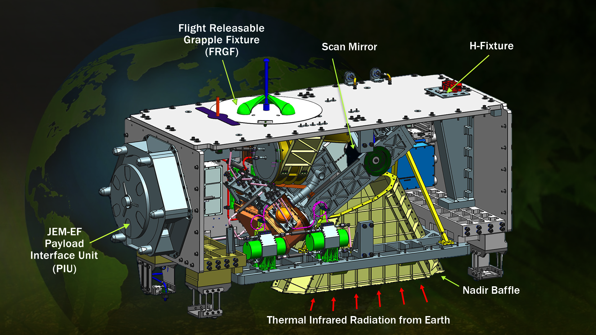
Much like your thermometer, the ECOSTRESS collects and records Thermal Infrared Radiation—heat waves—using a variety of instruments. The Nadir Baffle helps focus the heat being collected. The double-sided scan mirror spins almost every second, collecting data from a wide area. Unlike a common mirror, this scanning mirror collects heat imagery instead of visual images.
The Impact Of Heat On Community Health
Using maps to visualize heat data can help you better understand climate change and the impact of urbanization and heat islands on your communities. If you look at these images over time, you can see how construction and development—urbanization—creates more heat islands and reduces the coverage of the surface with plants, which cool the surface and atmosphere.
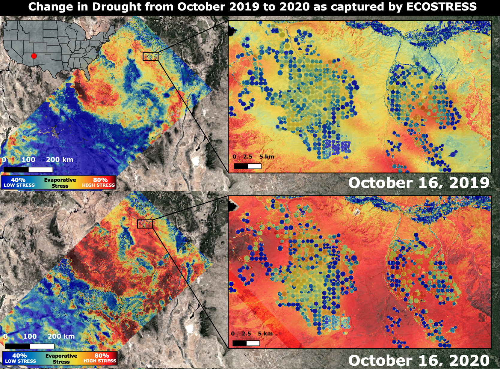
The US Environmental Protection Agency (EPA) research indicates that heat Islands compromise human health and comfort. Cities that have heat islands often have higher daytime temperatures, less cooling at night, and higher air pollution levels. These changes can lead to heat-related deaths and heat-related illnesses, such as respiratory issues, heat exhaustion, and heatstroke. Heat Islands also increase energy consumption because people use air conditioning more frequently. Increased energy use often leads to increased emissions of air pollutants and greenhouse gases. Increased energy use can also lead to a reduction in water quality due to stormwater runoff, which puts heated water into our streams and harms aquatic life.
As a citizen scientist, your job is to come up with simple actions and models that can reduce the impact of urban sprawl and to understand how hot is too hot for human comfort and health. What temperature is too hot for you? Ask your friends or family members what temperature feels too hot to them. Is it the same for you? That comfort level can be very personal. That’s why you need objective data! Tracking changes over time can help you understand the effects of climate change on your community.
Hot Enough For You? Cooling The Worsening Urban Heat Island
Heat Mapping Your Community
In the next activity, you will look at a map of your community and predict where you think the radiant heat would be highest based on your previous investigation with the thermometer. Then, you will consider five approaches to reducing heat in communities, select the best for your community, and develop a model to address radiant heat in your city. To help you organize your thoughts, we’ve created a journal for your work.
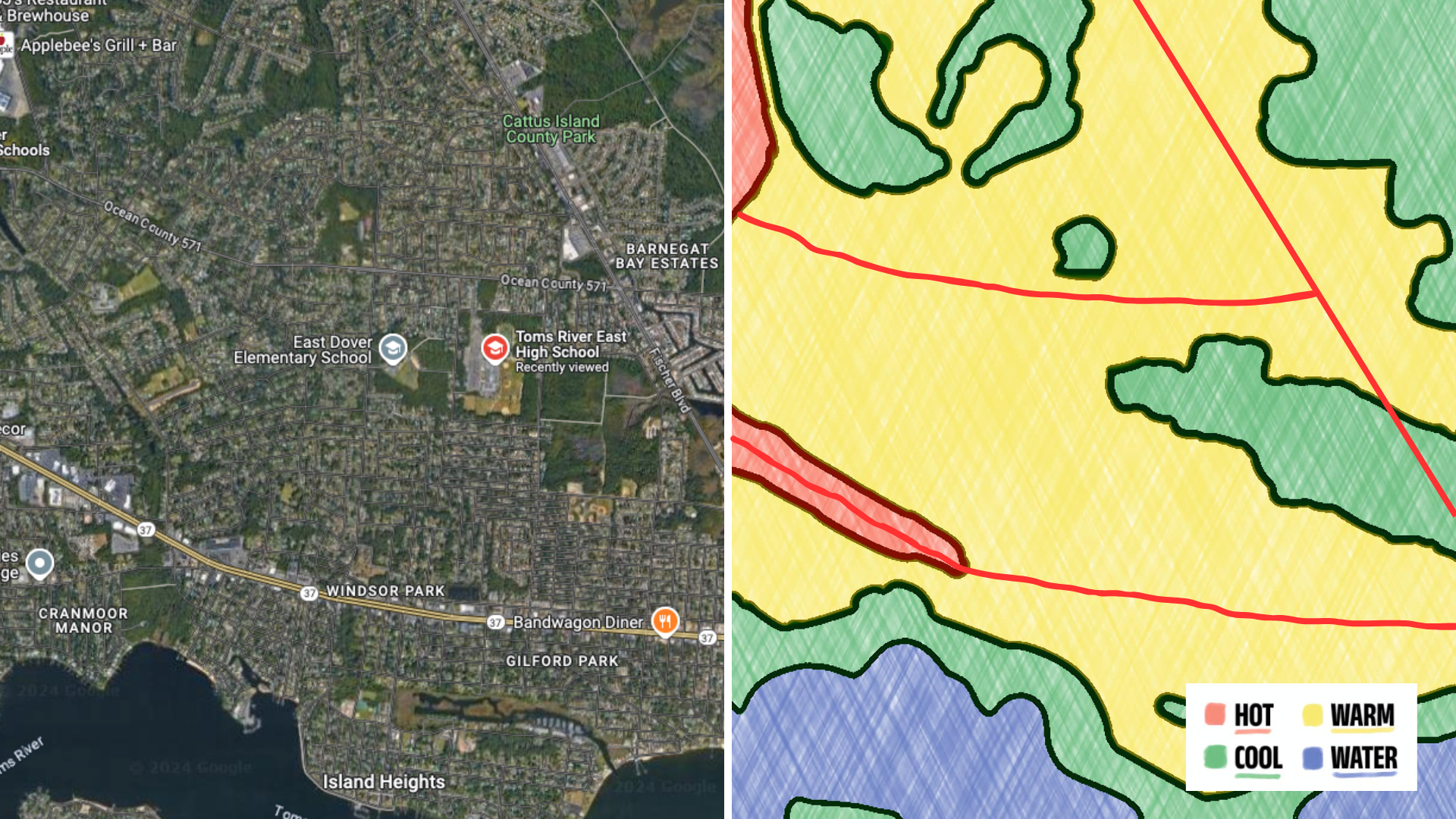
To get started, you need to get to know your community. Start by exploring NASA’s resources and data. Then, access a Google Map of your own community. The video below demonstrates how to use satellite images on Google Maps to analyze a community and make predictions. After watching the video, you will perform a similar analysis on your own community. (Instructions are also available as a slide deck.)
Get To Know Your Community
- Using Google Maps, search the address you would like to research, such as you school or home.
- Select the map area you are interested in. Use the plus and minus buttons on the bottom right corner of the screen to zoom in and out.
- In the bottom left corner, select Layers. Then, select Satellite.
NOTE: Visually impaired? Consider using Audiom to create your map.
As you look at the satellite image maps of your community and investigate potential sources of radiant heat, ask yourself these questions:
- Where on your map do you think temperatures would be hottest? Where would be coolest?
- What topographical features do you think make areas on your map hotter or cooler?
- Where do you think there could be a heat island? What features could cause a heat island to form?
- What other problem areas can you identify? What areas provide benefits to the community?
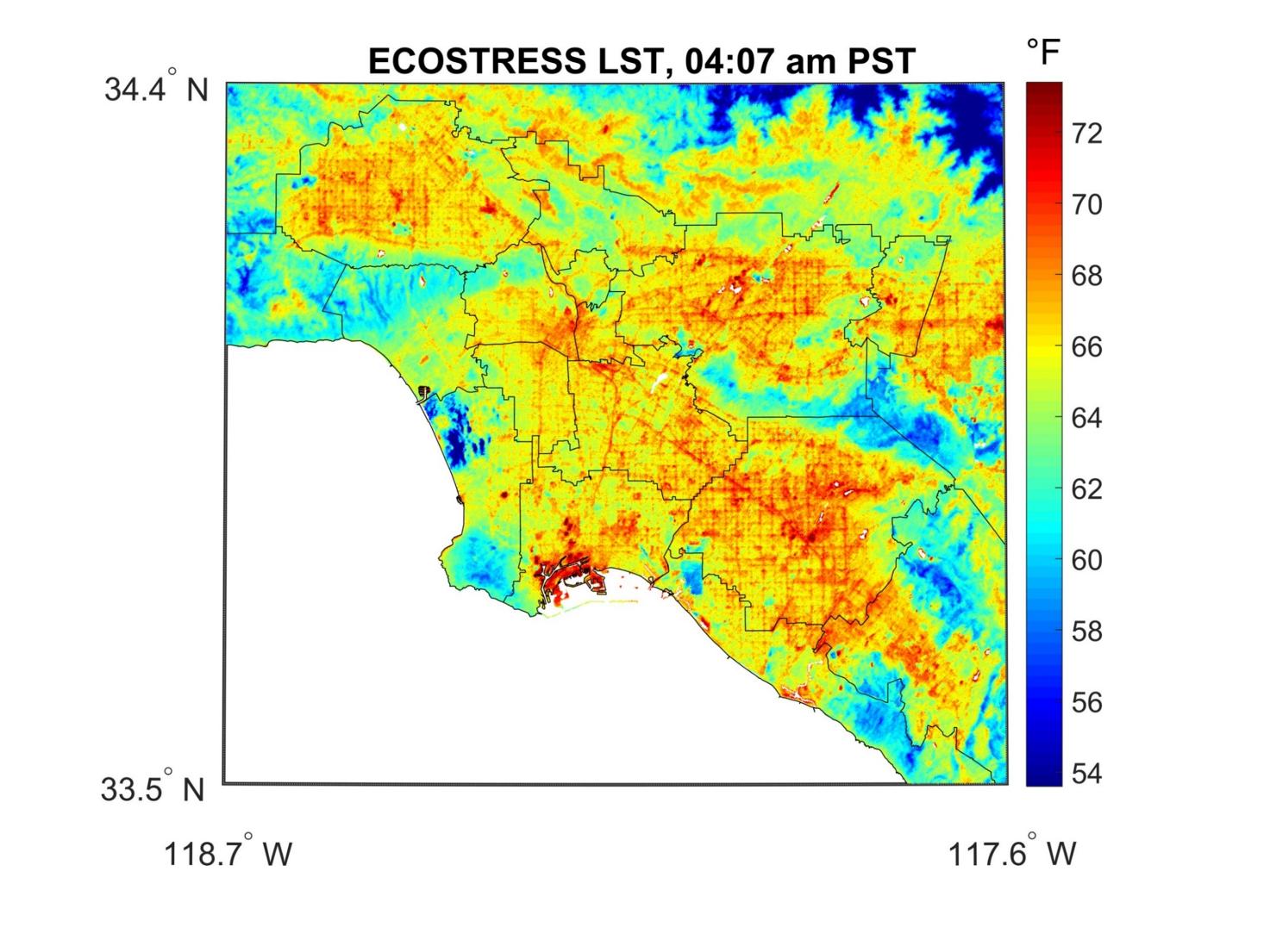
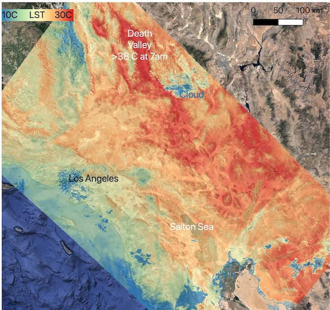
Make a heat map style drawing of your community. It does not need to be as detailed as the images from ECOSTRESS, above. Start by coloring broad areas using paper and colored pencils or an online drawing app like Canva. Use these instructions as a guide and refer to the sample image below for ideas.
Make A Heat Map Of Your Community
- Any areas that you predict would be over 70 degrees, mark as hot and color it red. Be sure to show where you think you might find heat islands in your community, like parking lots, streets, and highways. In rural areas, large patches of bare soil and recently plowed fields, fields with minimal vegetation, and fields using a large amount of agricultural plastic can also be heat islands.
- Areas that you predict would be cooler, under 60 degrees, mark as green. These are likely to be grassy areas like sports fields, parks, and bodies of water.
- Finally, mark anything in yellow that’s kind of in the middle, between 60 and 70 degrees. These areas are likely to be less densely populated than areas with lots of buildings and roads.
- Remember to include a legend to show what each color represents in your drawing.
Here’s an example drawing based on predictions about the same urban area in New Jersey described in the video.
As you review your drawing, ask yourself this question: What story does the data tell about the potential effects of radiant heat in your community?
NOTE: Want a bigger challenge? Use five colors and break down the temperature range by five degrees rather than 10. Or use Looking for something a little easier? Print the satellite map and tape a layer of plastic wrap over it. Then, use dry erase markers to color areas that you think would be hot or cool. Reduce the colors used to just red and green.
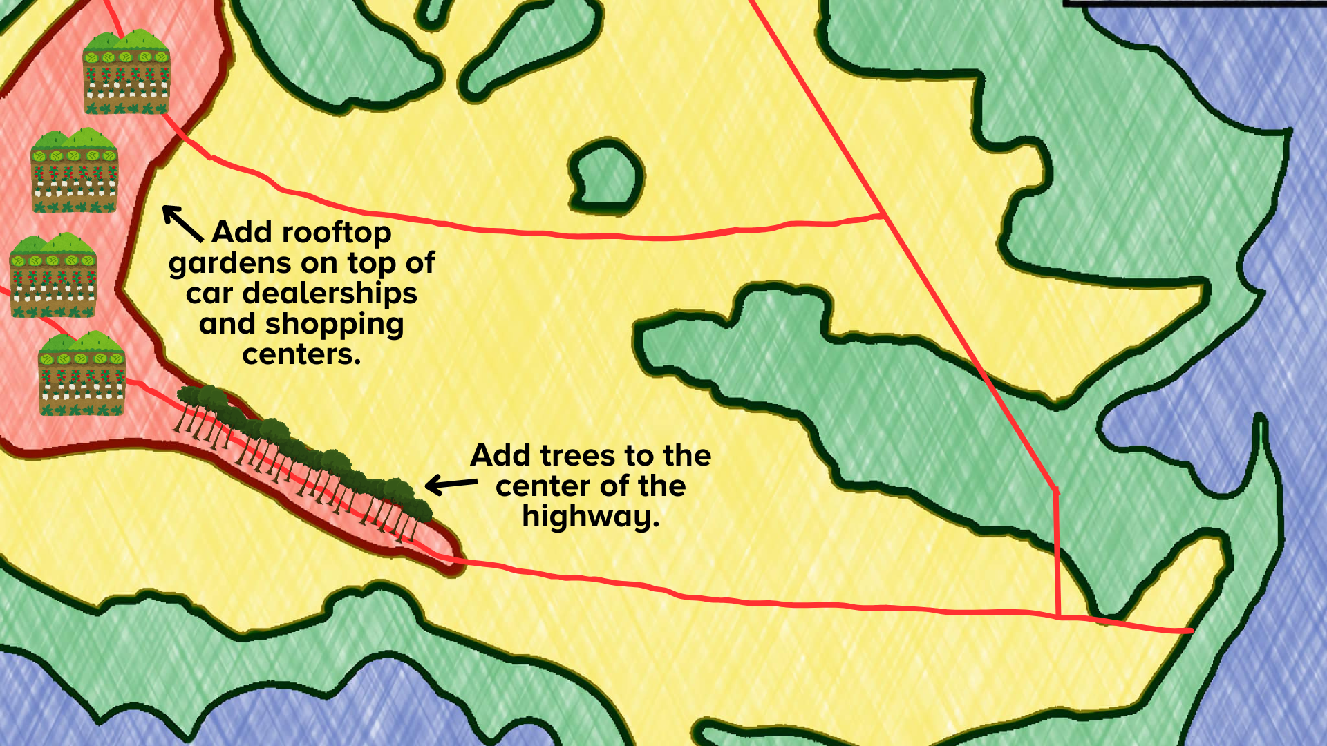
Imagine A Solution For Heat Islands In Your Community
Now that you understand the potential problem areas in your community, take action! Imagine you are an architect working with the EPA to help improve your community’s health and sustainability by reducing heat islands. The EPA suggests five big ways to cool heat islands:
- Increase the number of plants in the area, by adding park land and more green spaces.
- Use cool paving materials that may require coatings over existing concrete or asphalt, or even new grass greenways.
- Build green roofs in which a rooftop garden can provide more shade. Green roofs can be 30–40 degrees Fahrenheit cooler than non-green roofs.
- Install cool roofs, which absorb less heat due to their color (typically white) and reflective properties.
- Plan smart growth projects that add green infrastructure improvements to regular street upgrades.
Consider the red areas on the map you drew. Which of the five big ways to reduce heat islands would work best for your community? Why do you think that solution would work for your community? How would you know your solution is successful?
Add to your drawing of the community or make a new drawing. Mark where you would include features or change the infrastructure to reduce heat islands. Or, if you prefer, draw a detailed sketch of one change you would make, describe where you would add this new feature, and what it would include.

If you have the time and materials available, build a diorama model of your solution using a shoebox, scrap cardboard, and craft materials.
When you’ve planned your solution, share it! Post your heat island solution for your community in the Down to Earth Community Lab so others can try it out. Share a photo, and we’ll include it HERE for everyone to see!
NOTE: Ask your adult before sharing your solution. Be sure to remove any identifying information.
Want To Learn More?
Are you excited about the idea of improving your community and reducing heat islands? There are lots of ways you can get involved and learn more!
- Whose permission do you need to bring your solution to life? Check out your town’s website to find out if your town has a green team or a policy in place to help with decreasing heat islands. Check your town’s administrative code to see if there are rules around new construction or efforts to reduce heat islands. For example, some towns have limits on the proportion of planted area versus impervious surfaces like concrete.
- Make a proposal to your community to help solve the problem. Create a video, podcast, essay, or slide deck with your drawing to support your idea.
- People across the world are developing creative solutions to address heat islands. Artists are using reflective paints to create murals, farmers are planting rooftop gardens that also feed people in need, landscape designers are innovating the ways trees are planted in cities, and engineers have used geometry to design a building that responds to the movement of the sun to reduce glare. Maybe the next big idea will be yours!
- Learn more about the ISS with an augmented reality walk-through, and then discover when you’ll be able to see it in the sky!
NGSS Standards
- MS-PS3-3: Energy – Apply scientific principles to design, construct, and test a device that either minimizes or maximizes thermal energy transfer.
- MS-PS4-2: Waves and their Applications in Technologies – Develop and use a model to describe.
- MS-ESS3-3: Earth and Human Activity – Apply scientific principles to design a method for monitoring and minimizing a human impact on the environment.
- MS-ETS1-1: Engineering Design – Define the criteria and constraints of a design problem with sufficient precision to ensure a successful solution, taking into account relevant scientific principles and potential impacts on people and the natural environment that may limit possible solutions
- MS-ETS1-2: Engineering Design – Evaluate competing design solutions using a systematic process to determine how well they meet the criteria and constraints of the problem.
Career And Technical Education Career Clusters
- Architecture and Construction: This career cluster is focused on careers in designing, planning, managing, building and maintaining the built environment
- Science, Technology, Engineering & Mathematics: This career cluster is focused on planning, managing, and providing scientific research and professional and technical services (e.g., physical science, social science, engineering), including laboratory and testing services, and research and development services.
UN Sustainable Development Goals
Sustainable Cities and Communities: Goal 11 aims to make cities and human settlements inclusive, safe, resilient and sustainable.
Credits:
Lesson by Tiffany Lucey
Copyediting by Erica Williams
Digital Production by Sandy Roberts
![]()
Special thanks to the ISS National Laboratory and the Center for Advancement of Science in Space™ (CASIS™) for funding this resource. Working together with NASA, the ISS National Lab aims to leverage the space station to inspire the next generation.
This resource is part of Science Friday’s Down To Earth: Space Science For Community Change program.
Educator's Toolbox
Meet the Writer
About Tiffany Lucey
Tiffany Lucey links curriculum with instruction, and identifies student needs while consistently seeking alternative sources of funding. As a former Teacher of the Year for mathematics and computer science, she has become known for her interdisciplinary maker approach to learning.