Can Science Untangle Our Transit Maps?
22:49 minutes
It might just be the greatest graphic design challenge of all: How do you straighten out the spaghetti bowl that is the London Tube, Paris Metro, or New York City Subway to make an easy-to-use transit map? The question has real implications for millions of transit riders across the globe, and increasingly, researchers suggest that psychology and cognitive science could help provide designers with useful data about what works—and what doesn’t—in map design. MIT’s Ruth Rosenholtz and the University of Essex’s Max Roberts join Ira Flatow to talk about a few of the methods they’ve developed to put transit maps to the test. Rosenholtz describes how she visualizes what transit maps might look like in peripheral vision, and Roberts explains why he made the NYC Subway map a circle.
Max Roberts is a transit map researcher and Lecturer in Psychology at the University of Essex in Essex, England.
Ruth Rosenholtz is a Principal Research Scientist in the Department of Brain and Cognitive Sciences and the Computer Science and Artificial Intelligence Laboratory (CSAIL) at the Massachusetts Institute of Technology in Cambridge, Massachusetts.
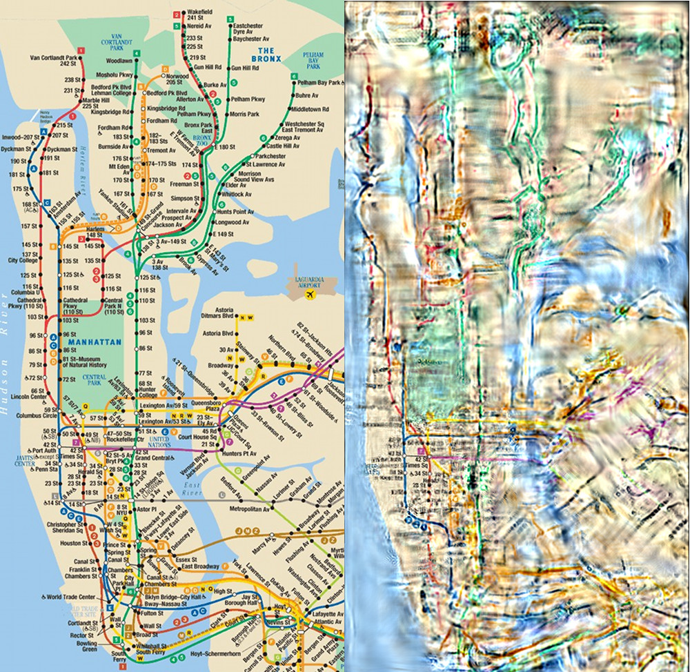
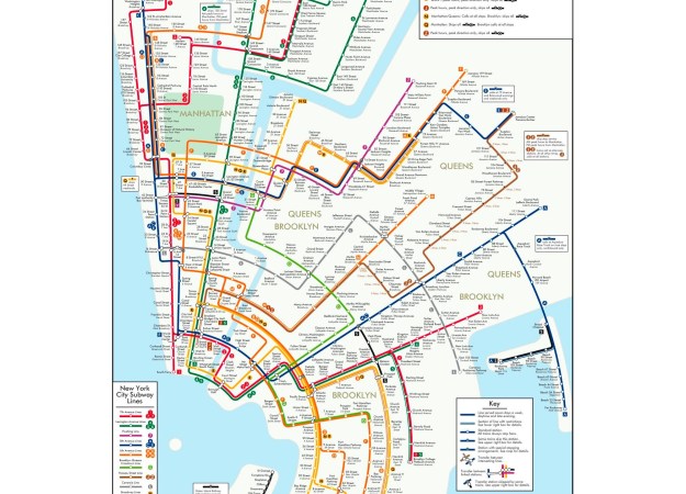
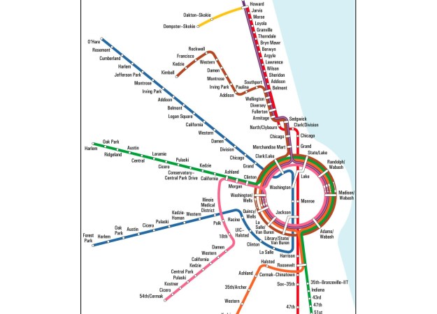
IRA FLATOW: This is “Science Friday.” I’m Ira Flatow. You know, every once in awhile, an idea so revolutionary erupts, so basic that when you see it, you say, why didn’t somebody think of that before? Well, that’s what I said when I got my first look at a radical new subway map of New York City. It’s not the official map, but an idea in which the multicolored subway lines, they don’t thread through the city like lost strands of spaghetti. They don’t defy you to trace their winding ways with an outstretched finger. But rather, they flow smoothly and predictably to and from their destinations in an easy to read typeface.
And this experimental map showed New York’s subway as a circle. Yeah, how many different ways can you make a subway map? How can we make them all better? It’s just one of the ideas scientists have put forward for improving transit map design. Can we use what we’ve learned about human vision to make maps more readable?
You’re in the subway. You’re running by the map, and you want to see where you’re going. The train’s coming. Can you take a quick look at it? Can we make a map that’s better to look quickly at and cut the time down? Can we run test figures to figure out what actually helps people on their journey from point A to point B? Well, my next guests are tackling those questions and more, so let me introduce them.
Ruth Rosenholtz is a principal research scientist in the Department of Brain and Cognitive Sciences at MIT. She joins us from Cambridge. Welcome, Ruth.
RUTH ROSENHOLTZ: Hi, Ira.
IRA FLATOW: Thank you. Max Roberts is a transit map researcher and lecturer in psychology at the University of Essex in the UK. He also designed a few maps himself, and he joins us from London. Welcome, Max.
MAX ROBERTS: Hello, Ira.
IRA FLATOW: Two great cities with two great subway systems.
RUTH ROSENHOLTZ: [CHUCKLES]
IRA FLATOW: [CHUCKLES] And we want to ask our listeners if they have any idea. If you have an idea how to make your local transit map better, easier to use, or can you suggest maps that you think hit that sweet spot between simplicity and complexity, give us a call. Our number, 844-724-8255, 844-SCI-TALK. You can also tweet us @scifri.
Max, you designed that circular New York subway map that I was talking about. How did you get an idea to make it into a circle?
MAX ROBERTS: I started off in London. In London, they’d opened up a brand new circular line around the outskirts of Central London. And there were people trying out circles, and I thought they weren’t doing it very well. So I tried to add a bit more discipline with perfect circles centered on one spot, and spokes were radiating from one single place. And then I was astonished at the response I got in London. I was expecting all to say, oh, you’ve messed about with the map. That’s horrible. Take it away. But in fact, large numbers of people loved it. And I then went on a world journey trying the map on different cities worldwide.
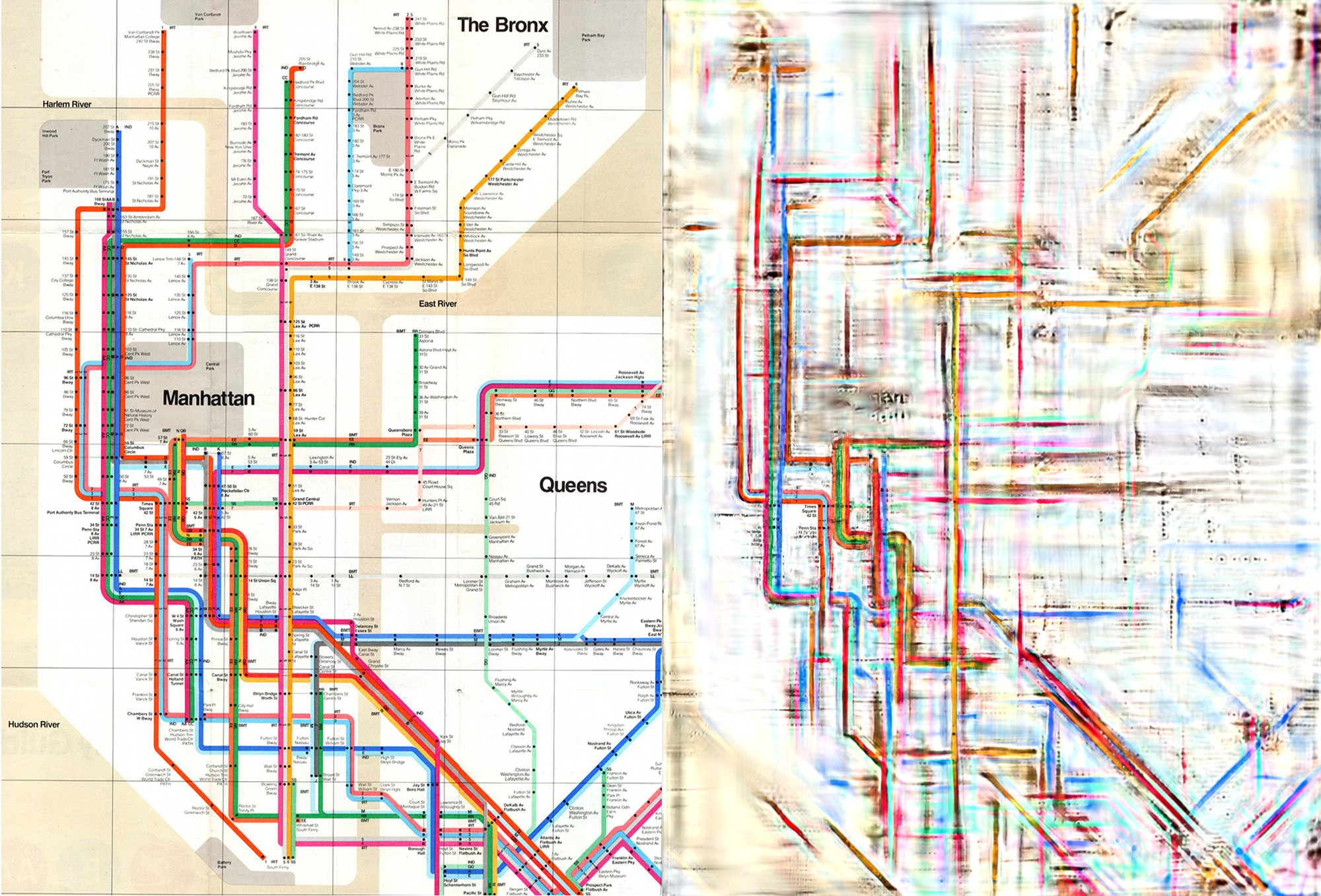
IRA FLATOW: And that’s great, because even seasoned subway people like myself, you’re standing there, and New York City subways they’re really like spaghetti. You’re trying to trace which train goes from New York to Brooklyn, and whatever. And you can’t really see it. And if you’re in a rush, it’s incredible. But Ruth, is that really reason enough to change a map, because you want to save five minutes?
RUTH ROSENHOLTZ: Well, that’s a good question. There’s a lot of different criterion that go into making something a good map or not a good map. But definitely, there’s things you could do from a human perception point of view to make it easier to quickly glance at the map and tell where you need to go.
IRA FLATOW: What makes a transit map design different? You specialize, Ruth, in how we look at things through peripheral vision. When we look on a map, are we really using peripheral vision?
RUTH ROSENHOLTZ: Oh, absolutely. And you can get an easy sense of this if you just poke a hole in a piece of paper and try finding the path from one stop to another one that you need to go to. If you’re only allowed to look through that hole in the piece of paper, it would be quite challenging. About 99% of your visual field is peripheral, so you use it for a lot more than you’re usually conscious of.
IRA FLATOW: Right. And Max, what makes a transit map design different than, let’s say, a regular above ground cartography map?
MAX ROBERTS: Well, the map’s trying to show you efficiently how everything’s connected together. So in theory, you know you’ll start in the destination station, and you’ve got to try and plan the routes as quickly as possible, the most efficient way possible. I always say a standard geographical map shows you where the network is. But a good diagram shows you how the network works together.
IRA FLATOW: Yeah. And Ruth, you spent a lot of time figuring out what stuff looks like in our peripheral vision. You said, punch a hole in a piece of paper. Is that what you do? Or do you do something a little more complex than that?
RUTH ROSENHOLTZ: We certainly do introspect on what we see, and we certainly have punched holes in paper, and actually looked at subway maps that way just to convince ourselves that you really did use peripheral vision. So for instance, another exercise you can do to get a sense of what peripheral vision is like– because we’re not used to introspecting on our own peripheral vision– is you could say, for instance, hold your hand up. I would say your open hand, so your fingers are extended. And then look a little bit to one side of your hand, but then concentrate on your hand and look at what you see. And it can be quite a jumble. You can’t really see the shape of your hand. For me, my fingers almost– it’s not clear which finger attaches to which part of my hand. And yet, I can see the wrinkles on the backs of my fingers, and so on. And so I’m getting lots of little detail, but it’s jumbled and messed up, somehow.
IRA FLATOW: How did you end up applying your peripheral vision model to transit maps?
RUTH ROSENHOLTZ: Well, in general, in my lab, we have two things we’re interested in. We’re interested in just the basic science of human vision, which these days, it mostly means peripheral vision. But we’re also interested in applying that to real world problems, like design. And transit maps are so cool for exactly the reasons that you’ve been saying. They can be really complex, and you’re allowed to design them in so many different ways. And two people could do two completely different maps for the same transit system, which means there’s a really rich place to study whether or not that design makes any difference.
IRA FLATOW: Yeah. And there have been a lot of designs of transit maps. Max, you say that putting transit maps to a public vote– which one do we like? You show people maps– might be the worst thing that a city could do.
MAX ROBERTS: Definitely. I’ve done lots of studies. You can measure people’s opinions, and you can measure real usability– accuracy, time to plan, time to find stations. And every single study I’ve ever run, the correlation between people’s opinions on how good a map is and how good it really is is a zero.
IRA FLATOW: Hmm.
RUTH ROSENHOLTZ: [CHUCKLES]
MAX ROBERTS: So people choose maps that they like, the maps that they expect to see, maps which conform to how they think a good map should be designed. And sometimes that gets in the way if the map is how they expect it to be, but it’s actually very badly designed.
IRA FLATOW: Of all the major “metropoli,” [CHUCKLES] is there a map that works the best?
MAX ROBERTS: I’ve never seen a map I haven’t wanted to fix somehow. There are some maps which are quite nice, generally for such smaller cities. I like the BART map in San Francisco. That’s a quite nice, clean design. And St. Petersburg always comes up with good maps. But most of these cities I see, there are some pretty bad maps out there.
IRA FLATOW: Yeah. Yeah, well the–
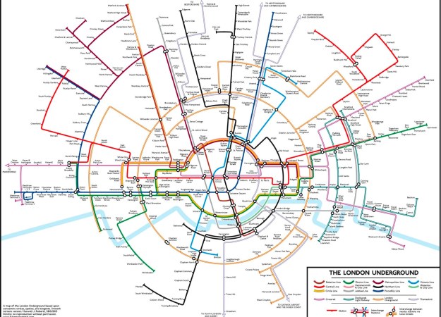
RUTH ROSENHOLTZ: I also really like– you’ve mentioned Max’s circular maps, and I really like his– he’s got this sort of swoopy, elegant, kind of elliptical map of the London Tube system, as well, that I really like.
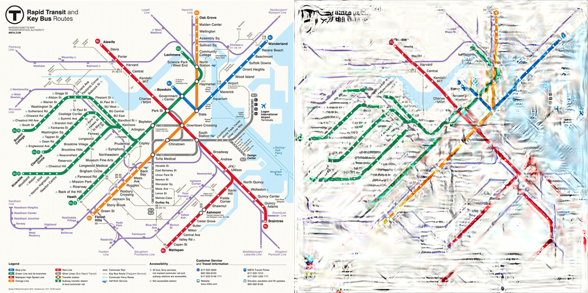
IRA FLATOW: Now, Ruth, I know what the Boston T map looks like, and you put that through your design test. What did you come up with? [CHUCKLES] I’m afraid to ask.
RUTH ROSENHOLTZ: That’s right. Well, so we had a really interesting opportunity because, as you mentioned, the Boston system decided they were going to let people, of all things, vote for their next T map. And they had already gone through a whole ton of maps and picked six top candidates. And so, yes, we ran our algorithm on all six of those top candidates, in addition to the current map. And some of them did quite well. None of them was really perfect, but you could see good things in almost all of them. And in fact, one of the ones that won was really quite nice.
IRA FLATOW: Mm-hmm. Mm-hmm. Let’s go to the phones, 844-724-8255. Let’s go to Daniel in Jacksonville, Florida. Hi, Daniel.
DANIEL: Hi.
IRA FLATOW: Go ahead.
DANIEL: So I’ve lived in a few different cities. And I lived in Denver, Colorado, who has a very good public transit system. And I actually worked with a high school, and I taught students with disabilities to use and access the public transit. I now live in Jacksonville, Florida, and it is incredibly frustrating for me because I like public transit, but the system is so wonky, and it’s hard to understand what’s happening, that I don’t use it all. Whereas in Denver, I used it all the time, now I don’t.
And along with that, I think the tool that gets used more often now is the online trip planning tools. And since I’ve lived in Jacksonville, I’ve gone through three tools. And all three of them have been relatively terrible. And it’s just really frustrating to want to use public transit and feeling like the systems around it aren’t built to allow me to [INAUDIBLE].
IRA FLATOW: Yeah. Yeah. Ruth or Max, any reaction?
MAX ROBERTS: It’s a worldwide trend that transit systems are coming up with journey planners, especially on computes. And I think it’s a very bad thing, indeed. Because if you’re always taking instructions about which trains or buses to use, then you don’t learn about the network. So if the system ever fails, you’ve learned nothing. And quite often, these systems aren’t very good. But what I really hate is that quite often, when a transit network creates a new computer journey planner, they’ll actually bury their maps, making it impossible to find. It’s almost though now they’ve got their computer system, they want to stop people from using these aids which might have helped them learn to use the network.
IRA FLATOW: Ruth, you put one of Max’s curvy maps of the London Tube through your peripheral vision model. How did it do?
RUTH ROSENHOLTZ: Yeah, so we both did that, and we had done the current Tube map as well. And so you should understand, a lot of what the model will tell you is, given a particular place that you’re currently looking, like say, a particular subway stop, what part of the map do you expect to be clear at a glance? And the parts that are clear at a glance will look very similar to the original map. And the parts that aren’t clear at a glance to your peripheral vision will look much more smeary and almost like you’re seeing them through some sort of warped glass or something like that.
And a lot of what makes a map good is the more of the area where the map is clear, according to the model, the better you expect to be able to see how the network works. And there’s definitely a much bigger area around the place where you’re pointing your eyes in max’s sort of swoopy map than in the other London Tube map that we were using. That was clear. So even though in many ways, Max is sort of violating a lot of the unwritten or maybe even written rules about how you’re supposed to design a transit map, he’d done such a careful job of it, I think, that it really ended up being quite good visually.
IRA FLATOW: One of the problems– I liked the maps I saw. The circular map was just beautiful. But one of the trade-offs, it seems, is whether you have form or function sometimes. I mean, a lot of maps– you want to know where exactly the stop is in the city, and you want the geography to be exact. But sometimes in these new maps, it’s sort of an approximation, just so you get cleaner lines and wider spaghetti [CHUCKLES] to see the map better. But you’re losing a little bit of the geographic specificity, aren’t you?
RUTH ROSENHOLTZ: Yes, that’s often the trade-off.
MAX ROBERTS: Yes, I try not to distort things too much. You can’t take them out too far beyond people’s comfort zones. And the current New York subway map, that’s actually very geographically distorting, anyway. And that’s worse in a way, because it looks as though it’s geographically accurate. But actually, it’s quite misleading in terms of scale and things. It might have you walking a journey when it’s a long, long way, or the opposite. So if it’s [INAUDIBLE] geographical, but it’s not, then it can trap you.
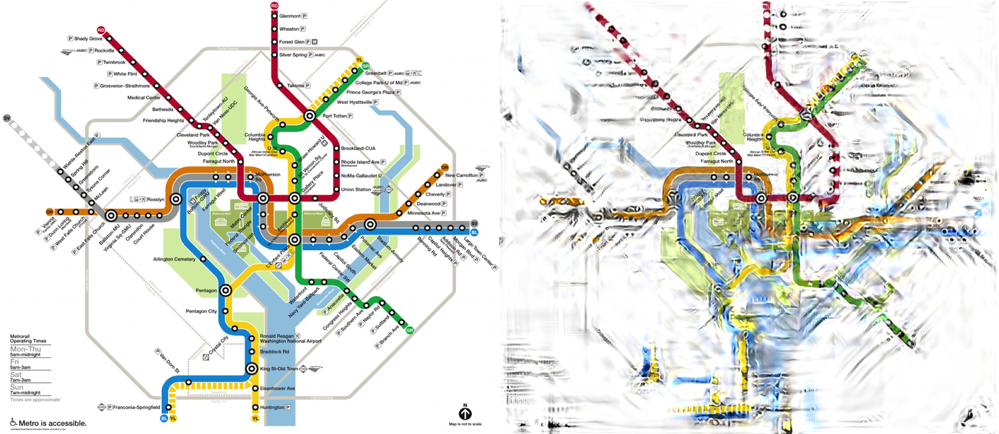
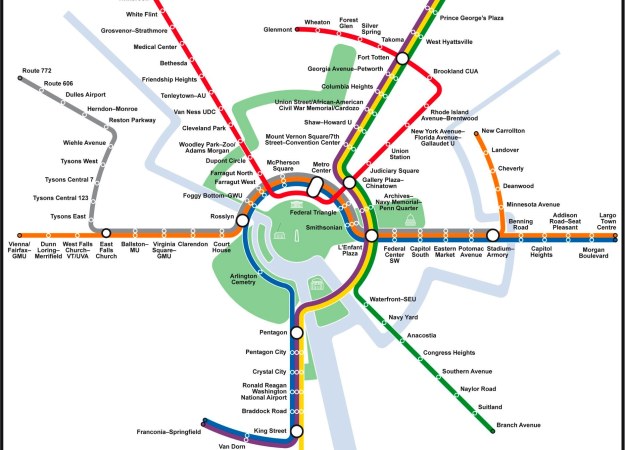
IRA FLATOW: Yeah. Ruth, we asked our audience on Twitter, what’s the easiest transit map to use, and we got a winner. And it was Washington, DC’s Metro.
RUTH ROSENHOLTZ: Yes, that’s right, which we then also ran our algorithm on, and it did do quite well.
IRA FLATOW: Let me remind everybody that this is “Science Friday” from PRI, Public Radio International. And it did well, because it’s very similar looking to BART system. I think they’re the same designers who created both systems.
RUTH ROSENHOLTZ: Oh, interesting. Yeah, so one thing that’s interesting about that– speaking of the geographic stuff– is they had tried to make some of the parks quite visible, which of course, are very important landmarks in DC. And they had also made some icons for some standard tourist kind of destinations. And those actually survived very well.
In addition, quite a few of the subway lines were reproduced well in peripheral vision, according to the model. And really, if you had to point to one thing that’s perhaps not ideal in that map, according to the model, it’s that there’s a blue line, and there’s also a river that’s almost the same shade of blue, which is quite confusing. I think, perhaps, not only in peripheral vision. I was confused for a moment myself as to whether part of the river what might be a subway line.
IRA FLATOW: [CHUCKLES] Let’s go to the phones. Let’s go to Collin in Washington, speaking of that Washington subway. Hi, welcome to “Science Friday.”
COLLIN: Hi. Thanks for having me. So I am a user experience designer by trade, so I work on usability for websites, and mobile apps, and those types of things. And I was wondering to ask the guests what does the medium of the map, so the way the user is actually looking at it, how does your research determine what impact that has, right? So are there more things we can do on a mobile phone, for example, that we couldn’t do on a paper map, you might find in a metro station?
IRA FLATOW: Ah, good question. Ruth, you want to take that first?
RUTH ROSENHOLTZ: Yes, I think, for sure. I mean, one thing that might be in between going to a full-on, “You don’t need to see a map; we’ll just tell you where to go” and having a map is that if you have a mobile device or a computer, it could keep the whole map there. But it could highlight and make more salient the part of the map that you need to care about. And that might turn out to be a good idea, for instance.
IRA FLATOW: What we’re doing with– and I tried this with Siri before I came on the air– I asked Siri, take me out to Flushing from Manhattan here. And Siri painted me a nice subway map on the Number 7 train, which would be exactly the right way to go. No other ways of going were suggested. There were other routes. And so it seems like what we’re doing is following what we do with our cars. We don’t look at paper maps anymore, right? We just put the GPS in there, and we have no idea of the scale of what we’re doing or where we’re going. We just follow those directions.
RUTH ROSENHOLTZ: That is often a problem with these small screens.
MAX ROBERTS: We have quite narrow roads in Britain, and we quite often get lorries getting stuck in country lanes. And they literally get jammed in, and they can’t get them out again. And the police have to come and help them back out. Yes, you can rely on certain having all these days if you want. But it’s possibly not advisable to rely on them too much. You might be missing out on bad things, or you might be missing out on some of the tricks the computer doesn’t realize you can do.
IRA FLATOW: Mm-hmm. But it seems like this is the future. I’m using the car analogy. More and more people are using that. Do we have to make better apps then for mass transit?
MAX ROBERTS: Well, it all depends on what you want people to do. If you just want to get from A to B by the way they’re told to you, then, yes, give them maps. But if you want people to learn about the city, how it fits together, about the whole city– when I was young, I was in my teens, I used a huge London bus map, just learn every square inch of London. It’s quite an achievement when you’re a teenager, just go out and explore like that. I don’t think I’d have learned nearly so much, and it’s turned out to be useful knowledge. And your big cities, it’s good to know where all the [INAUDIBLE] are and how to navigate them.
IRA FLATOW: I think there is absolute beauty in looking at a big map of things, no matter what it is. We’re going to take a break. When we come back, more on the science of map design, Ruth Rosenholtz and Max Roberts. Your questions, 844-724-8255. You can also tweet us @scifri. Stay with us. We’ll be right back after this break.
This is “Science Friday.” I’m Ira Flatow. Were talking this hour on the science of map design and what makes a good subway map. We’ve got some tweets coming in, a tweet from Jeff, who says, I’m still waiting for a colorblind friendly transit map. [CHUCKLES] How about that one? And people writing in saying, I live both in New York and San Francisco. They have equally bad designs. I’ve traveled all over the world. Someone else lives in Tokyo. They think Tokyo has the best transit map. Madrid? Madrid is pretty good, someone says.
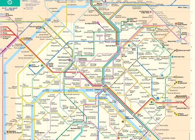
Well, let’s talk about one of your map studies, Max, you designed what you called a curvy map of Paris. Why did you do that?
MAX ROBERTS: It’s like the London curvy map. One of the things a transit map should do is make things simple. It should take complicated, twisting routes in real life and actually make them simple straight lines so they’re easy to follow. And the trouble with the official Paris map is it doesn’t do that. It takes [INAUDIBLE] places reality, then turns it to zigzags instead. So it’s not actually simplified Paris; it’s just changed the shape of the complexity.
So my reasoning was, well, let’s all these harsh zigzags, those 16 corners from end to end on Line 4, just try and smooth them out. Just try and ease out the shape. Give Paris a bit of shape. Show the loop lines and everything. And that curvilinear map’s actually very good. Every time I compare it against the official map, it comes out as 50% faster. So a journey that takes 30 seconds to plan on the official map, they usually can do that in 20 seconds on the curvilinear map. But even so, the curvilinear map;s not popular, because people say, well, it’s obviously the wrong way to design a map, so it must be hard to use. But it’s actually wrong; it’s the easier map.
IRA FLATOW: And how did your Paris curvy map do in your testing? You said it was a lot faster? How much faster was it?
MAX ROBERTS: 50% faster.
IRA FLATOW: 50%, that’s pretty good. And when you say faster, that’s how much faster you could just look at the map and see where you want to go.
MAX ROBERTS: Yes. Yes, time to plan a journey. And when you think about all the tourists in Paris, those extra seconds add up to thousands of years every year.
IRA FLATOW: Ruth, you put one of Max’s curvy maps of the London Tube through your peripheral vision model.
RUTH ROSENHOLTZ: Yes, that’s right.
IRA FLATOW: Did it love it?
RUTH ROSENHOLTZ: So we did the model as if you were looking at one of the stops in Central London, figuring that that would be a reasonable scenario, and so on. And yeah, often, we think of it as if these big straight lines are the best for maps. But I think if you do these curvy lines in the right way, you can be as good as or better as having a bunch of just straight lines in the map. So yeah, it did quite well.
IRA FLATOW: Let’s go the phone and see if we can get a quick call in from Matt in Baltimore. Hi, Matt.
MATT: Hey, how’s it going?
IRA FLATOW: Hey, there.
MATT: I’m a huge fan of “Science Friday.” I actually lived in Seoul for a couple of years a couple of years ago. And one of the things that I really liked about their metro system maps was when you were actually on the train, that there was a different entire map to display just the line that you were on. So each line had its own shape, and it was reflected on the independent maps inside of the train. So I was on the green line, which is the circular line in Seoul. So I got to know really well the shape of the city from going off of my line and then further out into each different line that was crossing.
IRA FLATOW: But you could see other subway lines meeting yours?
MATT: Yeah, you would only see the connections, though. You wouldn’t actually have to look at all of the different stations that were coming off of it. You would just see those independent lines.
IRA FLATOW: Thanks for that call. One of the things about these connections, Max and Ruth, is there are these little white dots and black dots, and they’re tiny little dots. And these are almost impossible to make out when you’re running very quickly. Is there a better system than that?
RUTH ROSENHOLTZ: Well, so in the Boston contest for the T maps, we saw a couple of interesting alternatives. I mean, first of all, I think some of them had really nice, large dots showing the stops. And in fact, you can see them in the DC metro maps, that they’re actually very salient. And again, the model predicts that they’re actually visible from quite far away.
And another map had little bumps on the side of the line instead of holes in the middle of the line. And you might not think that would necessarily make such a big difference, but those bumps are very visible in peripheral vision. And furthermore, they actually seemed to help by not having holes in the line along one of the lines. It keeps it from breaking up.
IRA FLATOW: Yeah, well, we’re going to wait for the ultimate subway maps. i think we’ll have to wait [CHUCKLES] a little bit longer, because it’s going to take a while. Ruth Rosenholtz, principal research scientist in the Department of Brain and Cognitive Sciences at MIT, Max Roberts, transit map researcher lecturer in psychology, University of Essex in the UK, Thank you both for taking time to be with us today, and have a great weekend.
MAX ROBERTS: Thank you.
RUTH ROSENHOLTZ: Thank you.
IRA FLATOW: And you can see all the maps we talked about today on our website. Go to sciencefriday.com/transitmaps.
Copyright © 2015 Science Friday Initiative. All rights reserved. Science Friday transcripts are produced on a tight deadline by 3Play Media. Fidelity to the original aired/published audio or video file might vary, and text might be updated or amended in the future. For the authoritative record of ScienceFriday’s programming, please visit the original aired/published recording. For terms of use and more information, visit our polices pages at http://www.sciencefriday.com/about/policies.
Annie Minoff is a producer for The Journal from Gimlet Media and the Wall Street Journal, and a former co-host and producer of Undiscovered. She also plays the banjo.